
UX Research
UX/UI Design
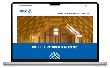
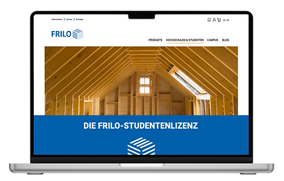
FRILO website
UI Design for the studentlicense website of FRILO Software GmbH.
Timeline
Oct. 2020 - April 2021
Team
Me
Methods
Focus Group
Market Research
Competitor Research
Keywords
UX Research
Prototyping
TASK.
FRILO is a structural analysis software manufacturer from Stuttgart and part of the Nemetschek Group. In 2020, FRILOs plan was to concentrate more on a student target group to bind students to the FRILO brand and system early on. To achieve this, FRILO's online presence had to be optimized and modernized since students had trouble finding the student license on the website. Most of them didn't even know that it existed.
DESIGN PROCESS.
*Note: Even though the process is displayed as linear here, it seriously isn't. During projects, depending on the research and new information that comes up through interviews, I go back and forth.
EMPATHIZE
- Market Research
- Competitor Research
- Target Group Research
- User Story
- User Journey Map
DEFINE
-
Focus group interview
-
Personas
-
Storyboarding
IDEATE
-
Brainstorming
-
Sketching
PROTOTYPE
-
low fidelity prototypes
TEST
-
Testing the prototype with the target group
AUDIENCE.
Due to FRILO's reorientation towards civil engineering students, it was clear that the focus should be on this group. But that doesn't say much about the students' needs, goals, and problems. When I look at a target group, I start with general information, e.g,. how many students study (civil) engineering in Germany, what the gender distribution is, etc., and then gradually work my way down to more and more detailed information. The best way to do so is to simply talk to the target group to understand what keeps them awake at night. In the 2019/2020 winter semester, a total of 56.103 students in Germany were enrolled in these subjects and aged between 19 and 26 years. Over 70% of them were male. Analytics from FRILO, as well as tests with the target group in one-on-one remote interviews, revealed that the target group also didn't understand the navigation FRILO had at that point. Their expectations regarding the location of the student license within the navigation system differed greatly from the actual location. Something that became very clear was also their priorities: Aesthetics are irrelevant; the most important factors are clarity, information on the website itself, and functionality.


USER STORY.
Based on this information (market- and target-group research) I recruited participants for my planned focus group interview and prepared a semi-structured questionnaire to go over all of the 6 competitors together. All in all the focus group took 2.5 hours and was held remotely since it was set during the COVID-19 pandemic.
USER FLOW.
Ideally, the SEO on the entire website is nicely done so that students directly land on either the microsite or the redesigned Website once they type it into Google. However, there is always the possibility of someone navigating through the website to the student-license website, which is what I am displaying below.
The design criteria that were extracted from the focus group offered two possible outcomes: Either re-designing the website or creating a microsite that entails additional points.
REDESIGN

Main Flow
additional flow
MICROSITE

Main Flow
additional flow
WIREFRAMES.
MICROSITE
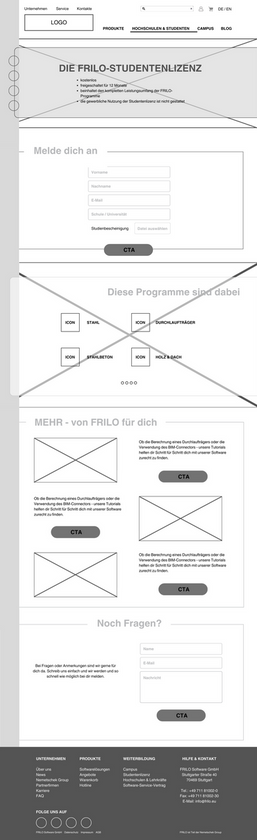
REDESIGN

DESIGN SYSTEM.
COLOURS
Primary Colours
R 0
G 95
B 170
Secondary Colours
R 246
G 180
B 0
R 88
G 129
B 193
R 74
G 72
B 70
R 163
G 197
B 233
R 203
G 202
B 205
FONT
The sans serif ‘Roboto’ in three versions has established itself as the company's corporate typeface: Roboto Black’ is used for titles and headlines, while the following line is always in “Roboto Regular”. Continuous text is in ‘Roboto Regular’ and captions and quotations are in ‘Roboto Regular Italic’.
BUTTONS
ICONS


RESULTS.
There were two ways to go: Either with a Microsite or with a simple redesign of the existing website. Since this was a customer project, I handed in both with a final recommendation from my side, so that FRILO could make an informed decision.
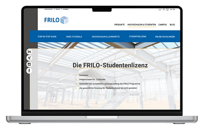
Microsite

Redesign

IMPROVEMENTS.
1
Accessibility & Responsive Design
The overall design needs improvements regarding accessibility and user flow.
Also, a mobile version must be created, which wasn't considered then. Today ( over 4 years later) my motto is mobile first.
2
Navigation
The navigation points need to be double-checked through another round of research (could have been avoided) and adjusted to the needs of the audience and the company.
3
Research Method
Honestly, today I would approach this issue differently. Depending on the resources, I would use card sorting to figure out how the target group would structure the navigation and do a remote usability study.
RESOURCES.
- Bertelsmann-Stiftung (2024) on GenNow_Einsamkeit_Daten_06lay.pdf
- Hahn, M. (2020). Webdesign: Das Handbuch zur Webgestaltung. Rheinwerk Publishing Incorporated.
- Jacobsen, J., & Meyer, L. (2019). Praxisbuch Usability und UX: Was jeder wissen sollte, der Websites und Apps entwickelt. Bonn: Rheinwerk Verlag.
- Keßler, E., Rabsch, S., & Mandić, M. (2019). Erfolgreiche Websites. SEO, SEM, Online-Marketing, Usability. 4., aktualisierte und erweiterte Auflage.
- Krug, S. (2005). Don't make me think: a common sense approach to usability testing. Berkeley: New Riders.
Pictures: Persona
-
Persona fotos by ThisisEngineering from Unsplash
Pictures: Header & Improvements section
-
by FRILO Software